
A Study in Contrast
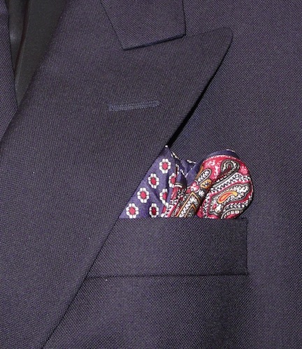
Spring has sprung, but St. Louis has been largely overcast as of late. Although the last few days have been a bit chilly as well, it just doesn’t feel right dressing in conservative winter colors as March comes to a close. With the sky a pale shade of gray, and natural light barely noticeable, some of the more shocking vernal shades are still a bit harsh on the eye. My solution has been to work with smaller swatches of subtle contrast to keep things light, but not too light.
The photo above is a perfect example of this. A garish pochette would look out of place, a futile rebellion against mother nature’s directions. But, the shots of dark red and marigold set themselves off nicely against the blue ground, which all but blends in completely against the coat. Now there is nothing left to do but sadly stow away the flannel, get the lilac, kelly green, and orange bits of my wardrobe ready, and wait, impatiently, for the real spring.


